Challenge Winner!
Mid Century Dining
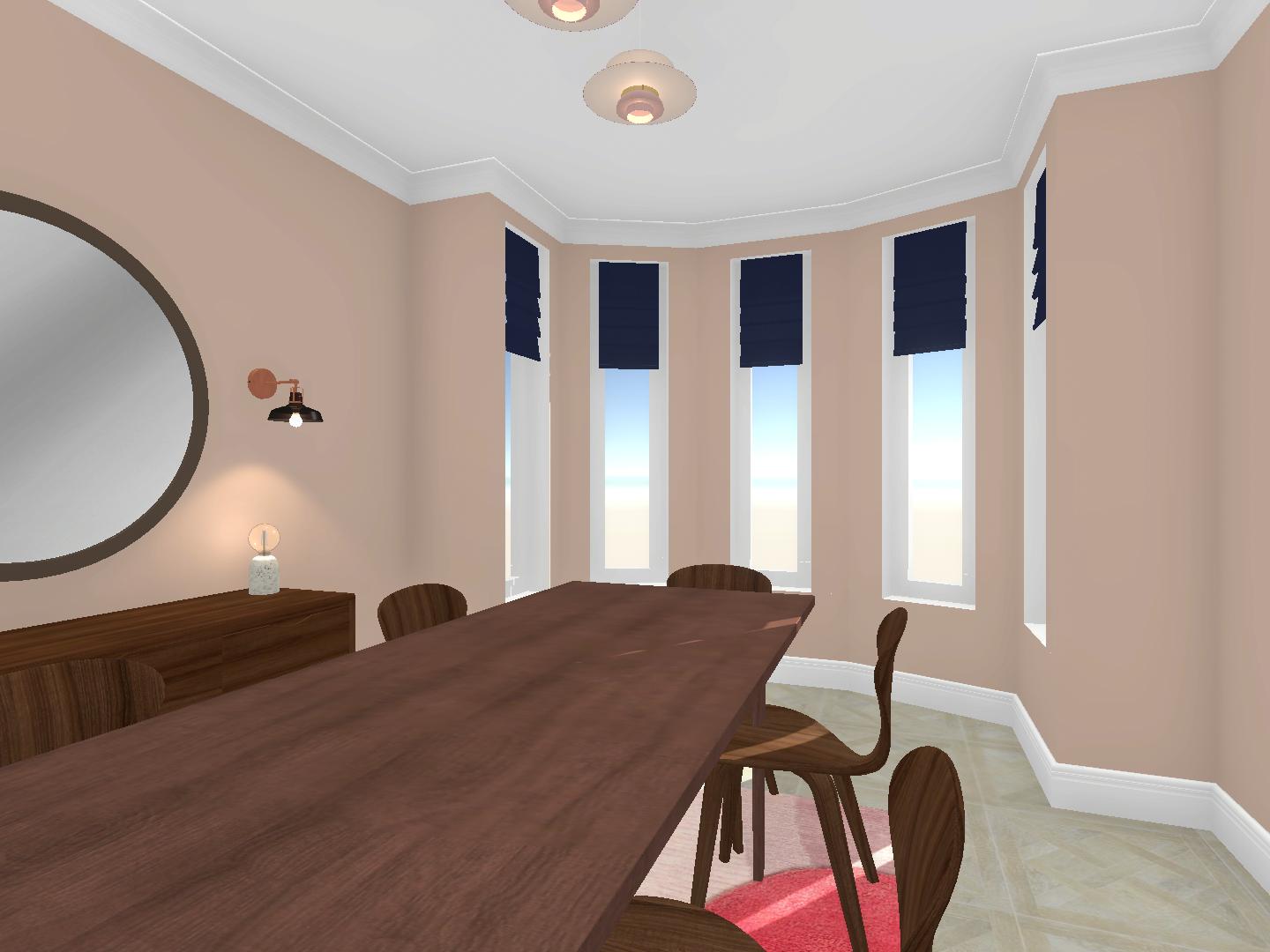
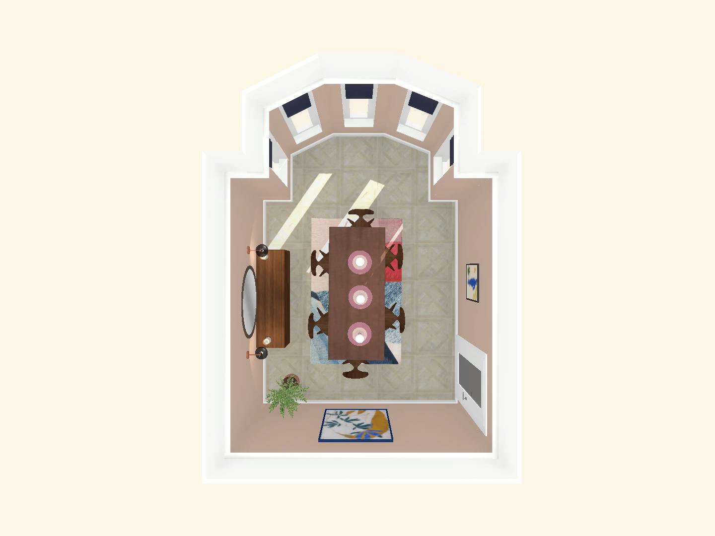
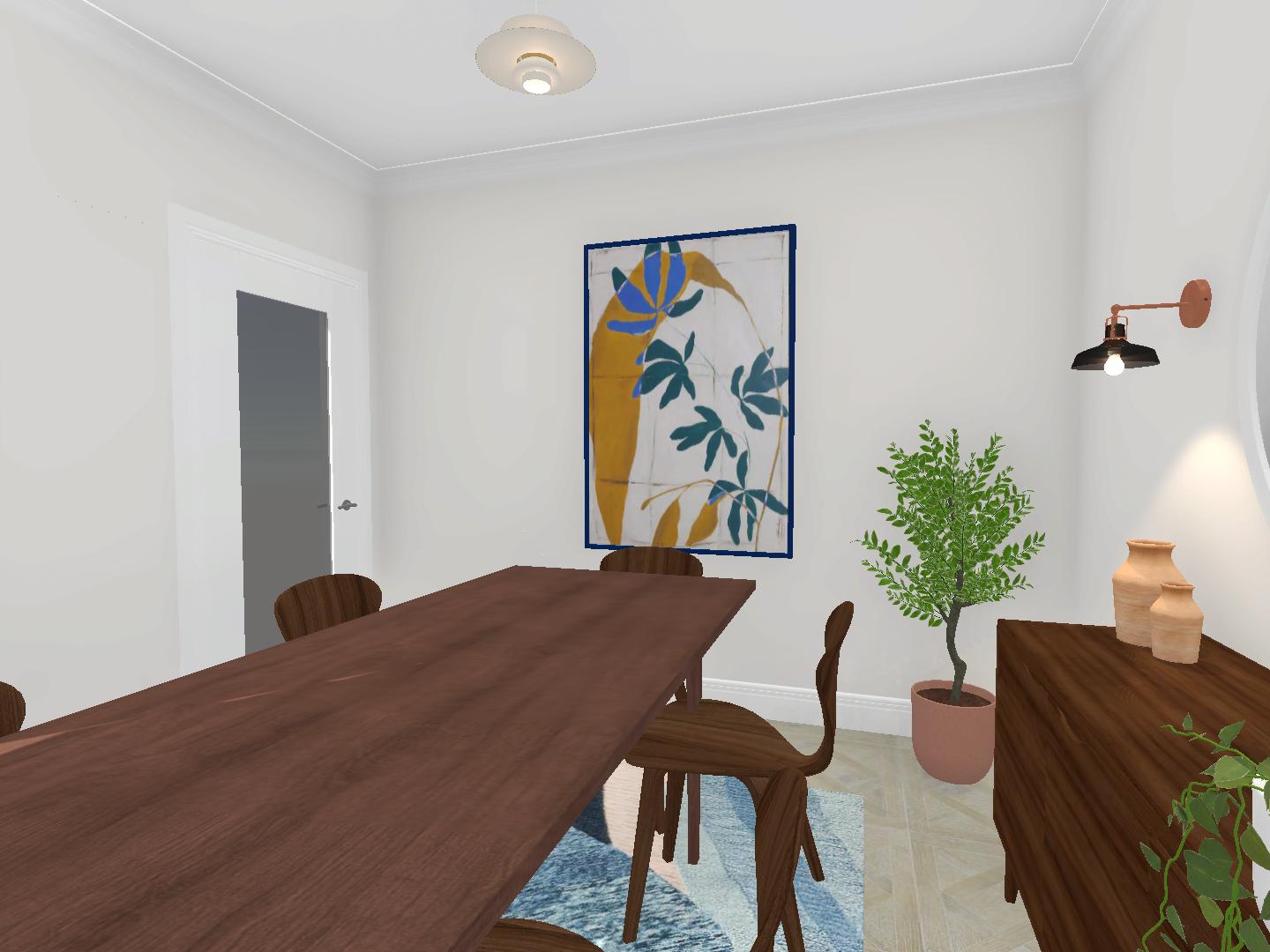
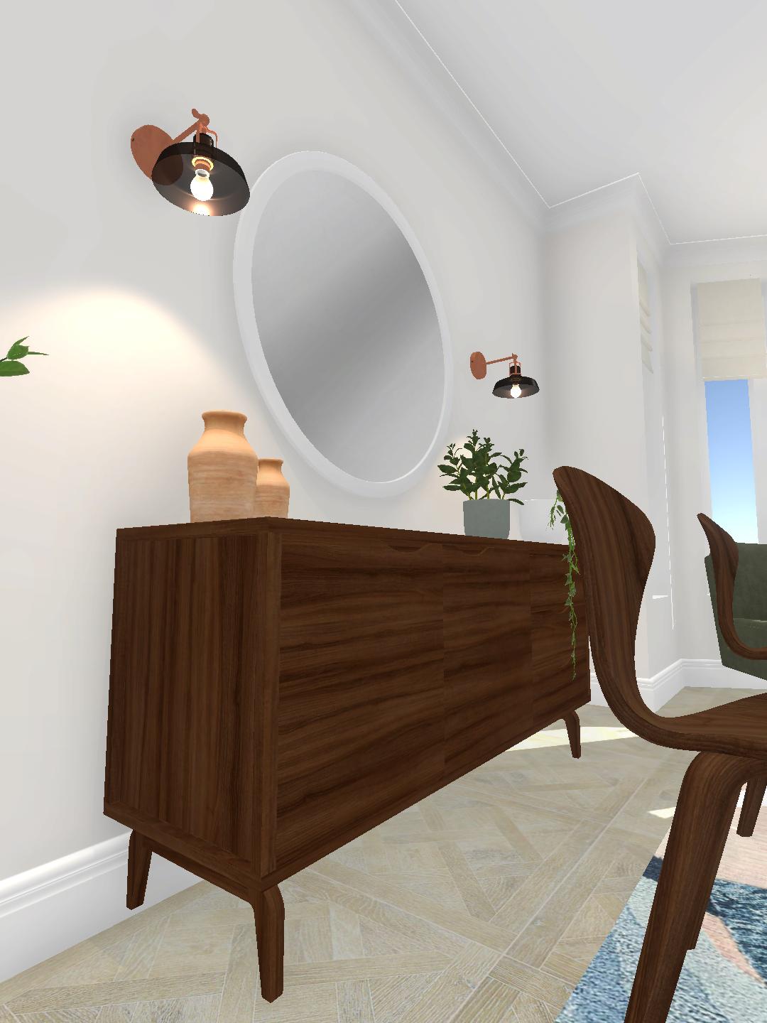
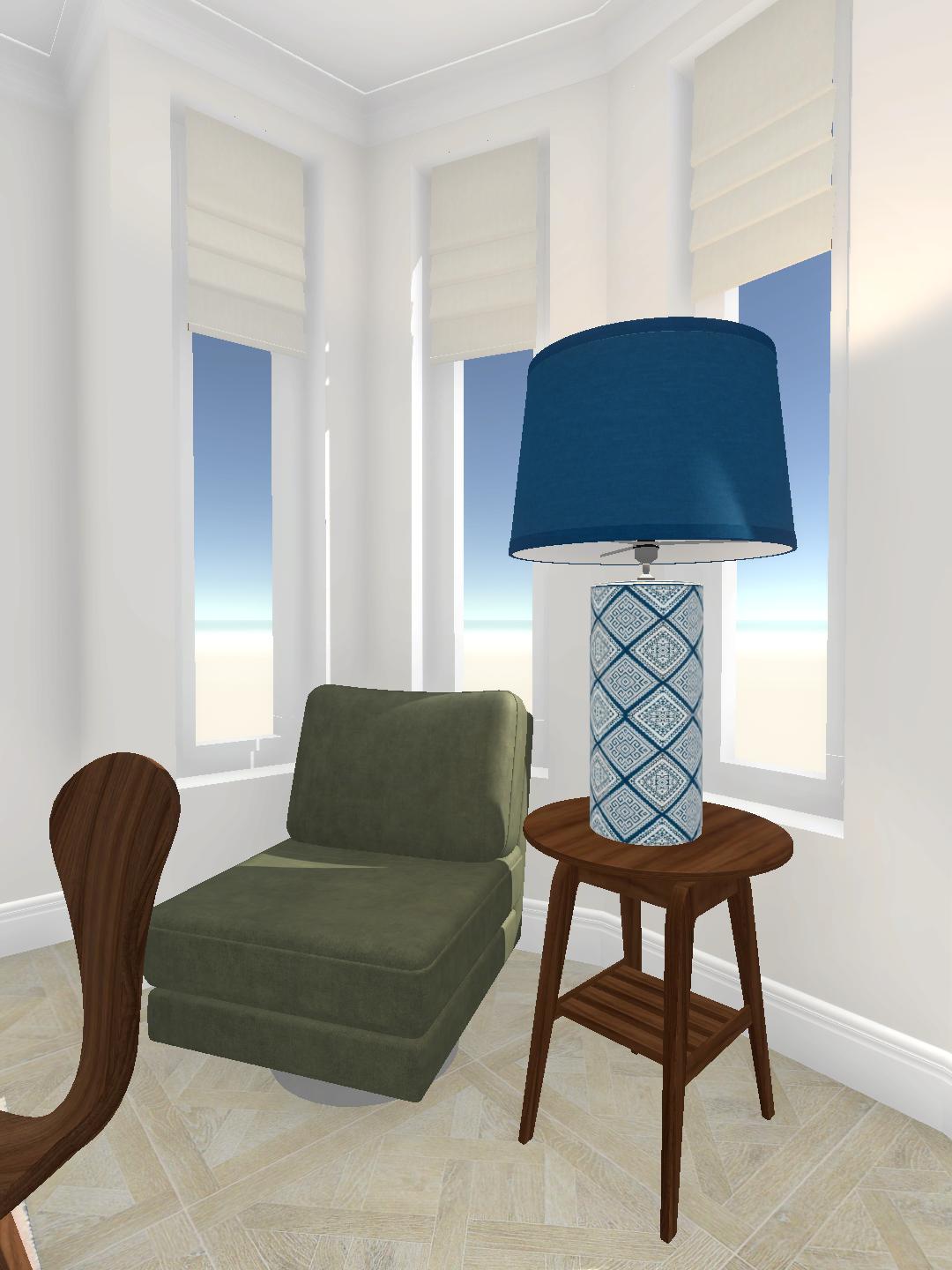
In this Mid Century Dining Room Layout design challenge the designers were asked to style and soften the room. In particular to focus on the bay window area with a comfy chair, table, lamp. They were also asked to style the sideboard decor to match in with the more neutral tone of the room.
Before
After
Before and After
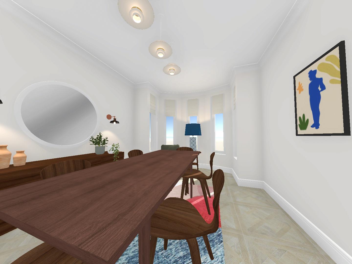
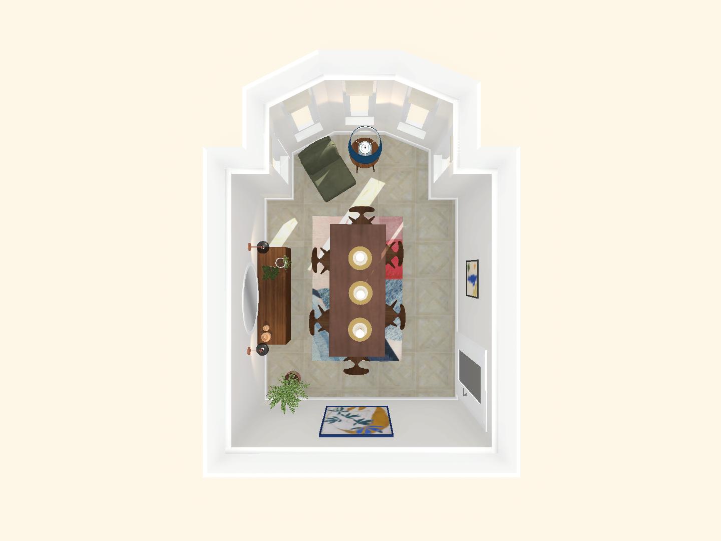
This was voted as the winning Mid Century Dining Room Layout idea, by our Instagram followers. The designer has created an inspiring dining room design using the Room Creator App. The use of neutral floor and wall colours have made the decor and wall art stand out in the room.
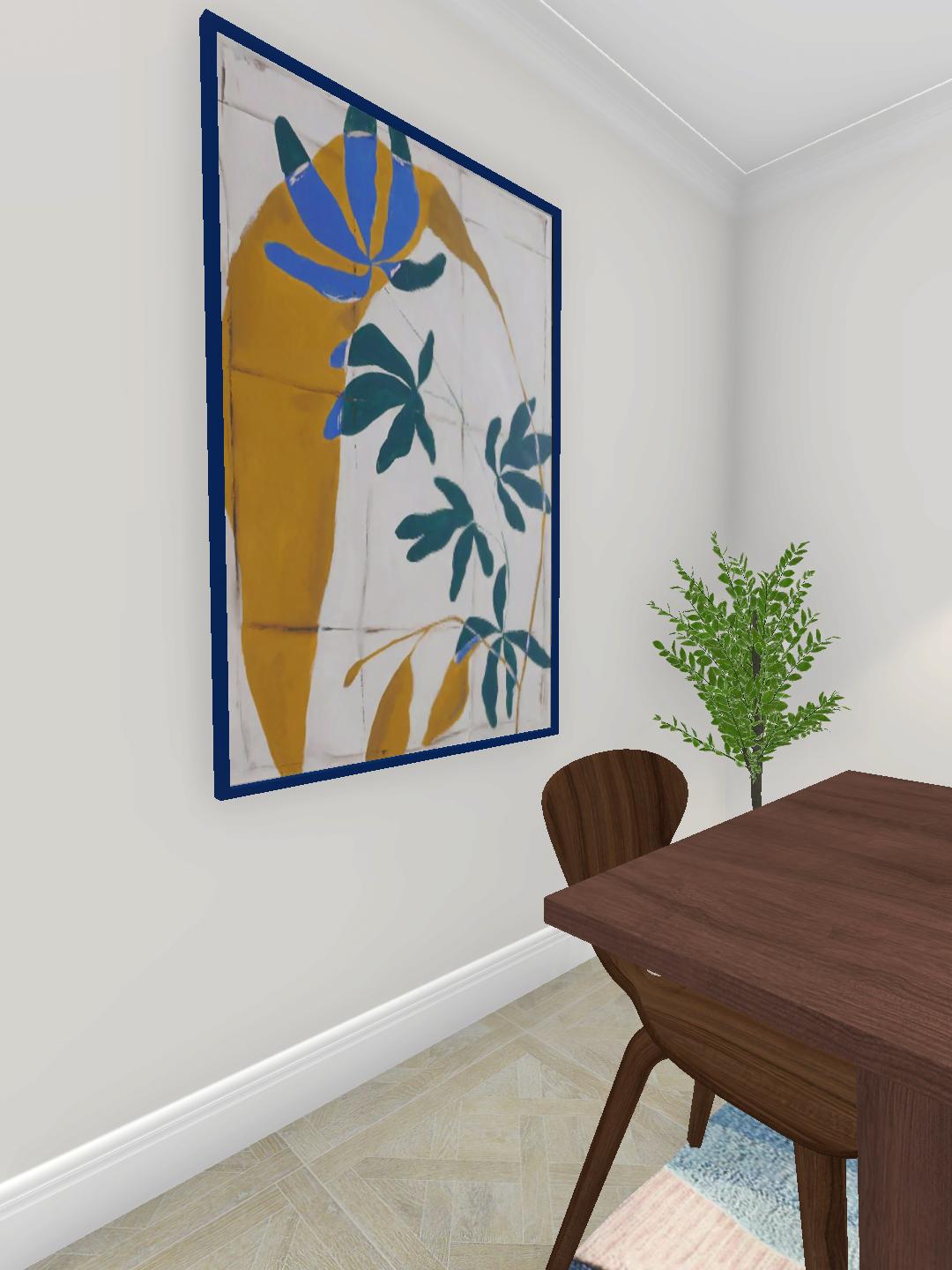
This room layout idea has a number of great zones. For example the beautifully styled Mid Century Sideboard with great decor on top provides a functional purpose as well as adding the room style. The bay window has been filled with an accent chair, side table and lamp as outlined in the specification. The stylish green mid century accent chair is elevated by the ornate table lamp. The third and final zone around the dining table centre piece is based around the flamboyant wall art. This yellow and blue art would be sure to be a talking point to a dinner party that this room is truly suited too.
This is just another great example of how virtual 3d room design Apps such as Room Creator are helping people become great decor and room layout designers!
Some products we love from this design.
Room Design App
Our fun interior design app allows you to explore room design, such as this farmhouse master bedroom design. You can add & change furniture and colour schemes & make the design your own. You can also enter challenges to showcase your design ability and win. Why not try it out today and see where your designs take you?
(This page may contain affiliate links for which we may be paid for if you purchase an item after clicking a link)
