Modern Neoclassical
We love interior design, so when we’re mixing it up to create challenges we sometimes come across combinations that shouldn’t work, but really do – they’re the sweet and sour of the design world!
Neoclassical design is a celebration of timeless design. In architecture think columns and plinths, in interiors you get grand, timeless design. Rooms that can be described as neoclassical have grand scale, with large light fittings, long curtains and using marble or stone items to achieve a classical design. So when it comes to modern neoclassical it does sound like we’re putting two things together that really shouldn’t go. The modern in this design gives neoclassical a twist, adding the ability to use it in smaller rooms, with some extra color and soft furnishings. This can create some stunning room designs.
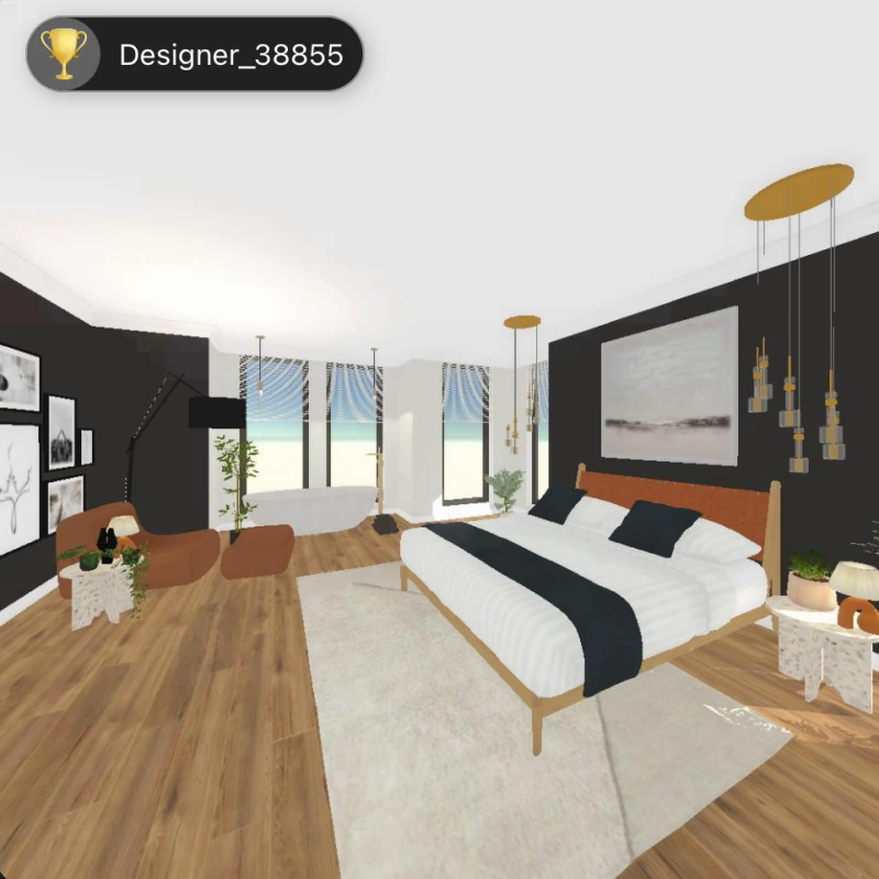
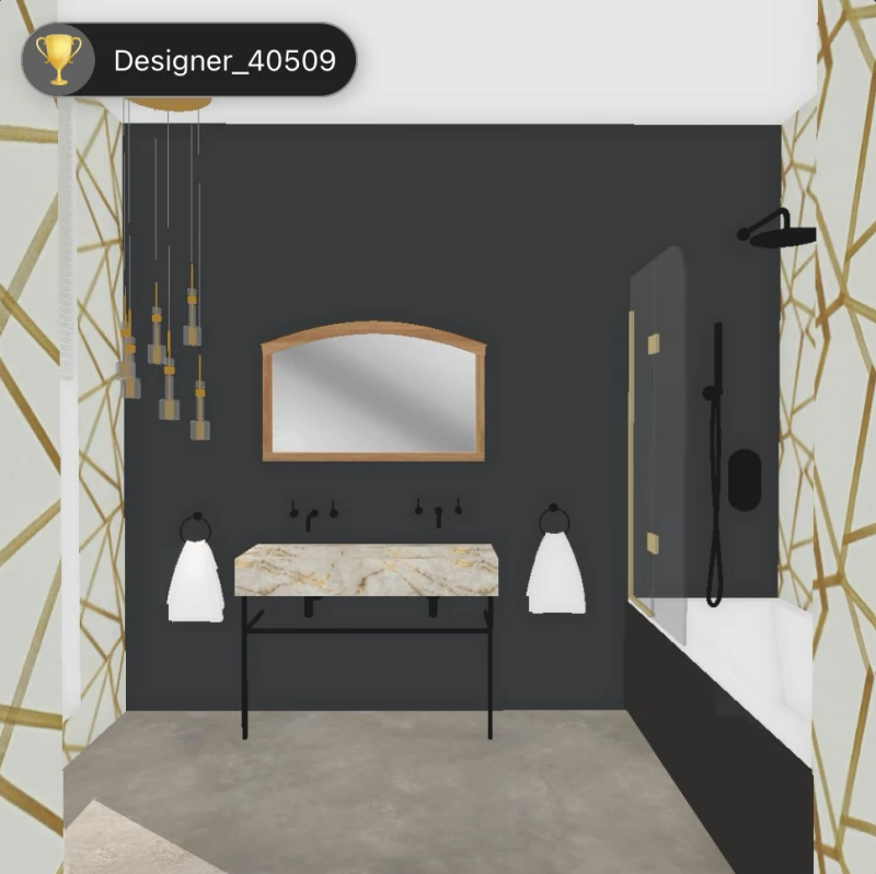
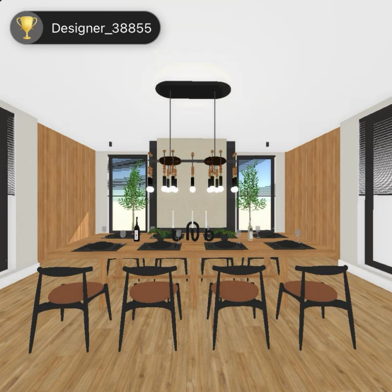
The winners of this week’s challenges have mixed classical with modern successfully, you can see in the dining room and bedroom designs have grand light fittings and use panels of color that give the rooms height, but their furnishings look more modern. The winning bathroom design also has a lovely classical light fitting, using marble for the sink and a large mirror is all very classical and it is complimented with the more modern wallpaper.


Don’t Forget To Vote!
Did you take part in these challenges? Don’t forget to vote on your favourite designs. It’s fun to see all of the submitted designs, these can give you ideas for design tricks that you can use in the future! The winners are available for everyone to view in the voting tab (in the top left there’s a switch to show winners).
Join in!
If you haven’t downloaded the Decor Creator app yet, you can get it for free and join the fun! We have six design challenges each week to showcase your design talents, and if you’re enjoying designing a room you can always submit more than one design by using the design again feature. Submitting more designs obviously gives you a better chance of winning a design trophy.
