Challenge Winner!
70’s Kitchen Revamp
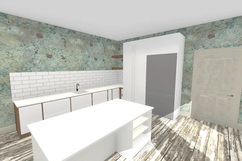
Before
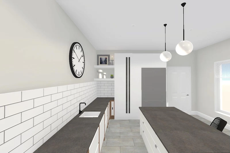
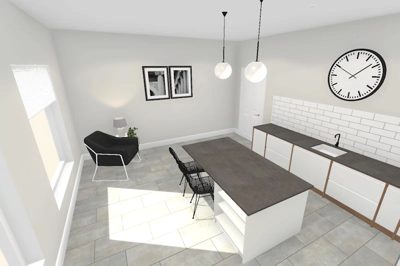
After
The Design Challenge
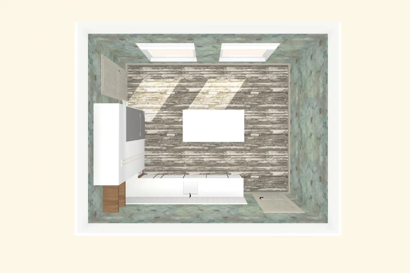
In this kitchen idea design challenge the designers were tasked with supporting Paula who had purchased a 70’s home in need of some serious attention. They had to create an incredible room by;
- Refreshing the walls, floor & joinery;
- Designing the perfect kitchen colour combi; &
- Identifying a feature ceiling lighting solution.
Before and After
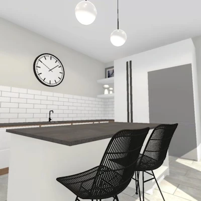
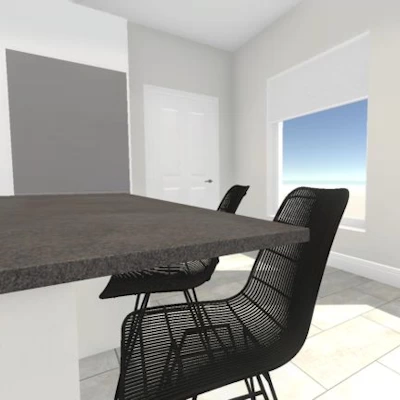
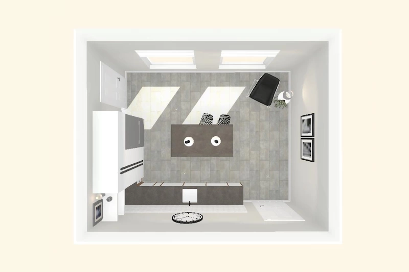
Our Instagram followers voted this as the winning design and in many ways it is easy to see why. This kitchen idea has held true to Paula’s specification of getting the perfect colour combo with a white and soft grey palette chosen as well as the addition of the over island lighting.
The white metro tiles have been retained above the workspace but the old run down wallpaper been replaced with a subtle grey tone which compliments the new worktop selection.
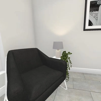
The rotten wooden floor has also been replaced with beautiful grey floor tiles laid in a brick pattern. The addition of the feature chair in the corner has added to the overall warmth of the room. This luxury seat is connected to the island by the selection of the wire frame seats to create that perfect seating area which a communal island forms.
Perhaps the best part of this design is the simple wall clock but I think it is the choice of the elegant pendants lights that have been positioned perfectly above the island.
This is a fantastic example of how virtual 3d kitchen design Apps such as Room Creator are helping people become great designers in all types of rooms from living rooms to bedrooms and bathrooms!
